Data Viewing
The dashboard combines visualization and control into a single, customizable interface.
Data Visualization Tools~
Live Measurements~
Displays the most recent data from all active Input and Function controllers. This is the first page shown after login.
Asynchronous Graphs~
Engineered for long-term data analysis (weeks/months/years), loading only the data points required for each zoom level to stay fast on large data sets.
Dashboard~
A fully customizable page that combines data views and system controls through widgets. Dashboard widgets intersect information with interactivity — use them to monitor sensor trends (charts, gauges), quickly control hardware (sliders, switches), view environmental data (weather, GIS maps), and receive AI-driven insights.
Tabs~
The dashboard is organized into tabs, shown as a strip along the top. Each tab is an independent dashboard with its own set of widgets and its own layout, so you can separate screens by purpose — for example a "Greenhouse A" tab, an "Irrigation" tab, and an "Overview" tab. Every widget belongs to exactly one tab.
Manage tabs from the tab strip:
- Create a tab — click the
+button at the left of the tab strip. A new tab ("Dashboard N") is created and opened. - Rename / delete / duplicate — click the gear (settings) icon at the right of the tab strip to open Dashboard Settings. Edit the name (must be unique) and Save, or use Duplicate (copies the tab and all its widgets) or Delete. Deleting the last remaining tab automatically creates a fresh one.
- Reorder tabs — drag a tab left or right in the strip. The new order is saved automatically.
- Lock a tab — in Dashboard Settings, click Lock to freeze the arrangement and hide the editing controls. Click Unlock to edit again. Locking is per-tab.
Adding and arranging widgets~
With the current tab unlocked:
- Add a widget — choose a widget type from the dropdown and click Add Widget. The widget is placed on the current tab.
- Move / resize — drag a widget to reposition it, or drag its corner to resize. Positions are saved automatically.
- Configure a widget — click the widget's gear icon to open its settings in a drawer that slides in from the right edge (a bottom sheet on phones). For most widgets there's no Save button: each option you change is applied and saved automatically after a short pause, and the widget re-renders in place. If a change doesn't turn out the way you wanted, click 되돌리기 (Revert) in the drawer's footer to restore every option to what it was when you opened the drawer. A few options that would require rebuilding the widget from scratch — such as the AoT Map widget's base map or 3D render mode — still need the classic Save button; see AoT Map below.
- Move a widget to another tab — in the widget's settings drawer, pick a different tab from the Tab dropdown (shown when more than one tab exists). Like any other option, the move is saved automatically.
Key Widgets~
Beyond the basic charts and controls, AoT provides several feature-rich widgets. The most notable are listed below; for the full catalog see Supported Widgets.
AoT Map~
See the sensors and devices scattered across your greenhouses on one map, and control them right there. Click a colored marker to see its latest reading or flip an output on or off. Built on MapLibre GL, it supports GIS overlay layers, 3D terrain and facility rendering, and smooth zooming.
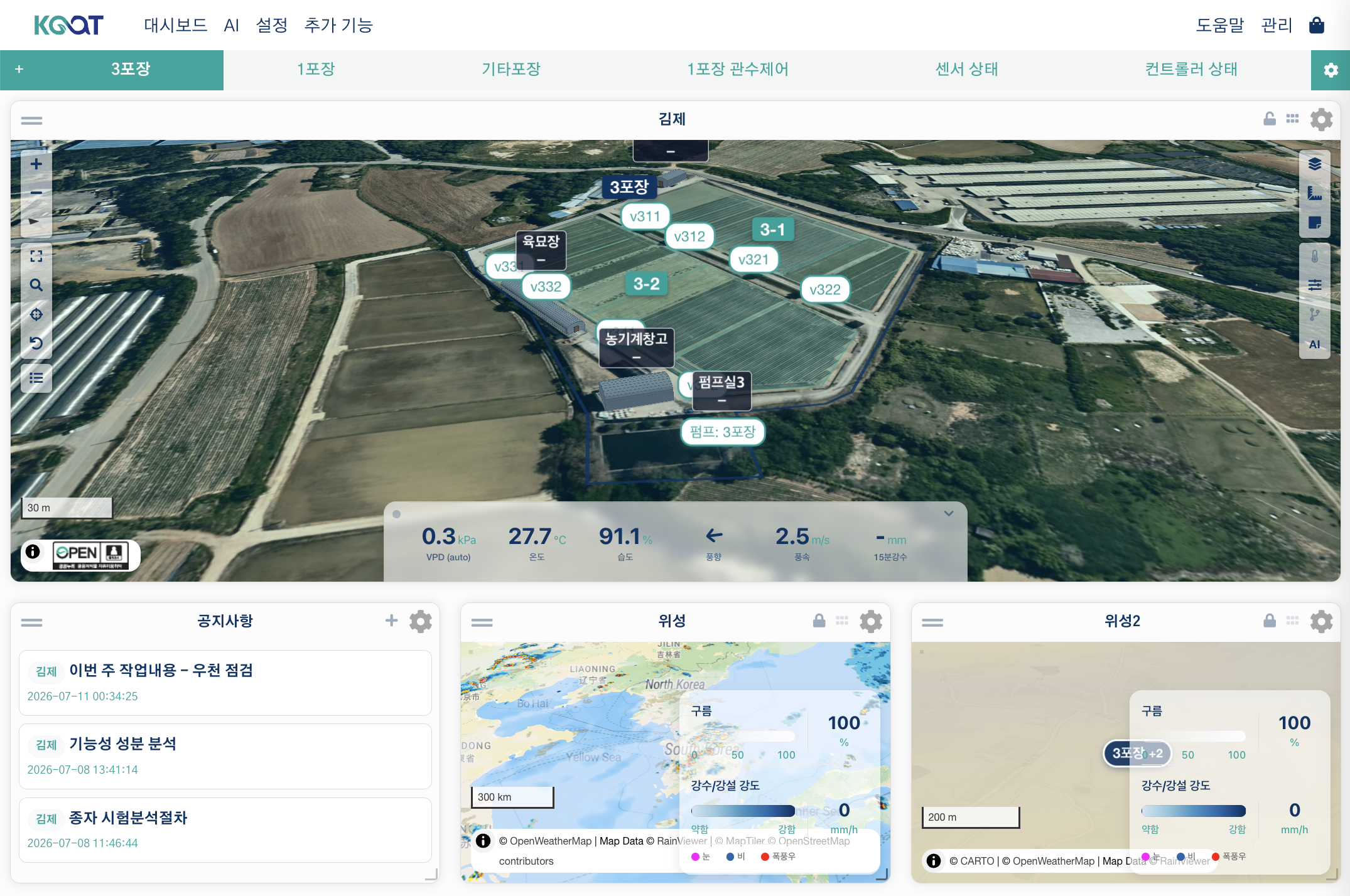
Key options
- Map — select a saved map, or set a fallback latitude/longitude and zoom.
- 3D map — set the default pitch, bearing, and facility render mode (Default / Solid / Wireframe / Performance).
- Devices — select which Input, Output, and Function devices appear on the map.
- Measurement panel — choose the measurements shown in the side data panel.
- Labels — a master
Show Labelsswitch plus collision prevention, spacing, and text size. - Sensor labels — marker style (circle or text), decimals, and a click-to-open 24-hour chart popup.
- Shapes — toggle site / zone / facility / equipment / device polygons.
Notable: realtime sensor values are anchored on the 3D structures, and — when the global AI is configured — the latest AI advisories appear as clickable chips at the top of the map. For the full option list and details, see the AoT_map widget page.
AoT Plot~
Keeps a single plot's status resident on the dashboard — its stage timeline, targets alongside current readings, trends, and accumulated heat — for the plot you want to keep an eye on continuously through a season, rather than clicking into it on the map each time. Device control is deliberately left out (that stays the map or facility widget's job). Which plot to watch is picked from a searchable dropdown in the widget body itself, not from the settings drawer. See the AoT Plot widget page for the full walkthrough.
Sequence Controller~
Once you've built a Sequence function — say, an irrigation routine that runs a main pump plus several valves in order — this widget lets you turn it on and off, see which step is currently running, and control which days it runs, all from the dashboard. You can reorder valves or toggle a day off without leaving the dashboard.
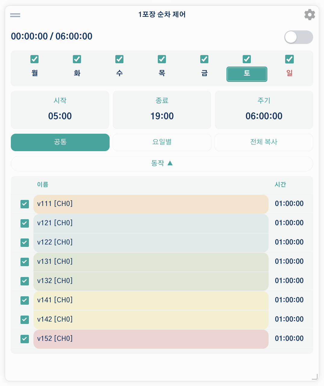
The screenshot above is a real, running irrigation sequence. The checkboxes across the top enable or disable each day of the week, the fields below show the start time, end time, and period, and the action list at the bottom lists the valves in order (steps in the same color are a device group). The toggle next to the title switches the whole sequence on or off immediately.
Key options
- Sequence Function — select the sequence to control.
- Refresh (Seconds) — how often the widget updates.
- Show Actions List — whether the action list is visible by default.
- Sequence settings (synced) — start time, end time, cycle period, startup delay, and step crossing time. These edit the underlying sequence and stay in sync with it.
Notable: the widget body shows a weekly schedule — per-weekday enable checkboxes with tap-to-edit day cells, so you can set which days the sequence runs directly from the dashboard.
AoT Timer~
Turns an output on for a set time, then off again automatically — the simplest way to automate a pump or fan without building a full Sequence. For example, set Cycle mode with a 20-minute run and a 1-hour-40-minute rest to water a bed for 20 minutes every 2 hours, repeated for a set number of cycles. Simple mode instead runs once for a set duration (0 = run until you stop it).
Key options
- Output — the output channel to control.
- Sync (Seconds) — how often the widget refreshes the operation status from the server.
- Timer — on (default): shows the timed controls below. Off: the toggle simply switches the output on or off, ignoring any run/rest/cycle/scheduled-start settings — use this if you only want the widget as a plain switch for this output.
- Operation Mode — Simple (default; a single run,
0= run until stopped) or Cycle (repeat run/rest for a number of cycles). - Cycle settings — the run time, rest time, and cycle count to use the first time you start a timer on this output. After that, the widget remembers and reuses whatever values you actually ran last, so these defaults won't reappear once you've started it at least once.
- Scheduled Start (hh:mm) — a wall-clock start time in the device's timezone (
00:00= start immediately; a past time schedules for the next day). - Show Status — display the current phase (running / resting / scheduled) in the title bar.
Notable: a background worker on the server drives the run/rest cycle, so closing the dashboard tab never stops it. If the app restarts while a timer is still waiting for its scheduled start time, that schedule re-arms itself automatically the next time the dashboard checks in — but a cycle that was already actively running or resting at the moment of the restart is not resumed, so check the output manually after an app restart.
AoT Graph~
Overlay several measurements on one time-series graph (built on Highcharts Stock) to see how they relate. For example, plot a greenhouse bay's temperature and humidity (Input measurements) together with its VPD (a Function measurement) and its irrigation valves' run time (Output measurements), so you can see at a glance whether a temperature spike lines up with a watering cycle.
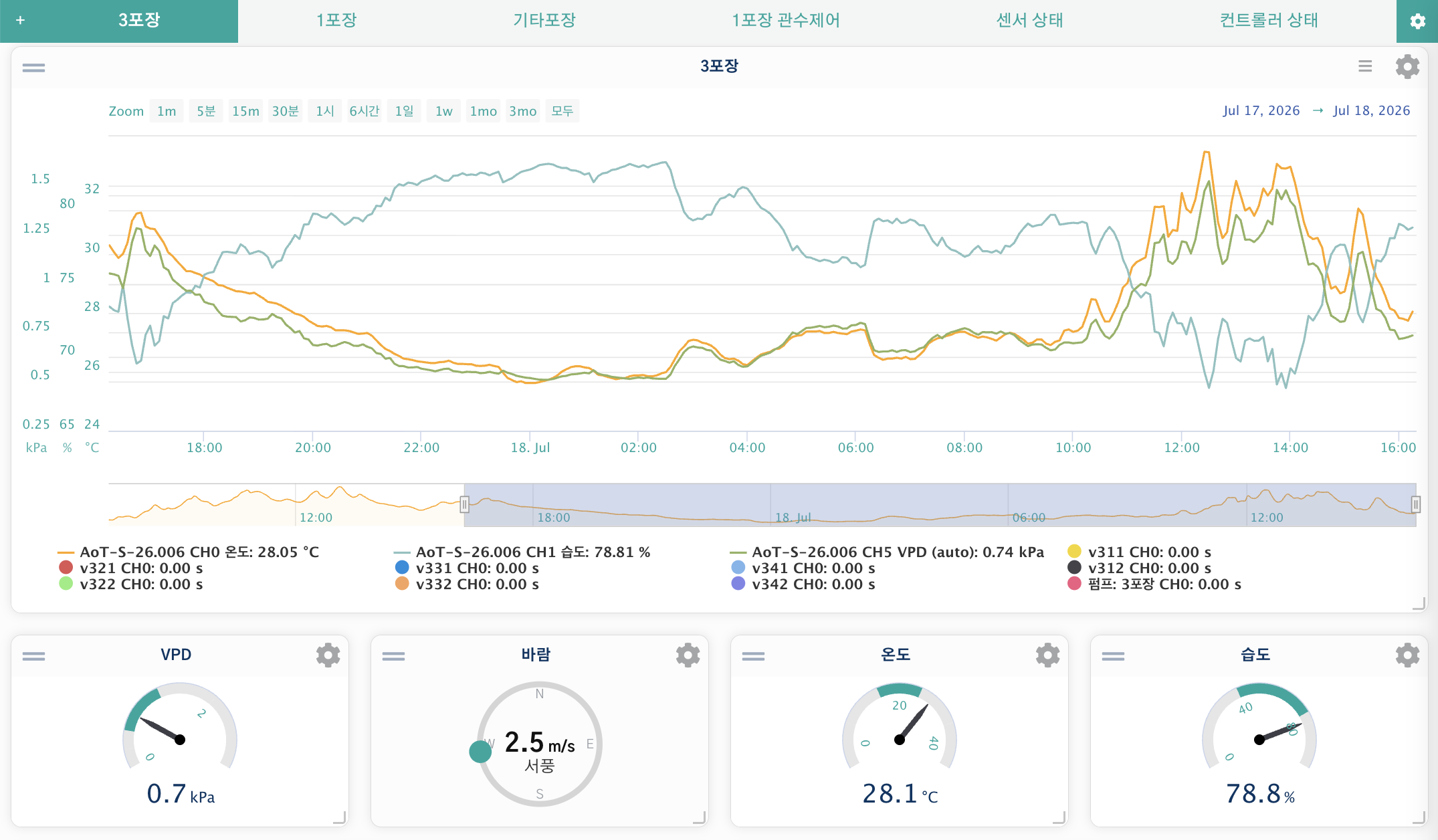
Key options
- Time axis — refresh interval, X-axis duration and unit (day / hour / minute), auto-refresh, and an X-axis reset that snaps back to the live window.
- Data sources — multi-select Input, Function, Output, PID, and Note Tag measurements (hold Ctrl / ⌘ to select several). There's no fixed limit on how many you combine, but the color palette has about 16 colors — beyond that, extra series share a fallback color.
- Graph style — toggle the header buttons, title, navigator, export, range selector, and legend, plus per-element font sizes and a mobile axis-label hide option.
- Per-series (in the settings modal) — custom color, series type (line / step / column), data-grouping toggle, and manual Y-axis min/max (shared by every series with the same unit).
Notable: history loads on demand — the widget normally holds only the configured window, but using the range buttons (1m … 3mo / All) or zooming fetches earlier, downsampled data and merges it in. The Reset button returns to the live sliding window. For longer-range historical analysis outside a dashboard, see Asynchronous Graphs.
AoT Circular Gauge~
Shows a single measurement on a circular gauge with colored bands.
Key options
- Measurement — the Input, Function, or PID measurement to display.
- Minimum / Maximum Value — the gauge range.
- Number of Color Sections — how many colored bands the arc is split into (each section's color and start value are edited in the settings modal).
- Preset Config — Custom, Temperature, Humidity, or VPD. Presets automatically set the min/max and follow the global band colors.
- Display — decimal places, data/unit font size and weight, and value position offset.
Notable: presets pull from the global 5-band palette (Settings → Custom UI), and the gauge can push its section colors back to those global band colors. Make sure the Maximum Value matches the top (High) section for correct display.
Function Status~
Displays the live status of a Function, Conditional, or PID controller you choose in its settings. Click Details on the widget to open a modal with that controller's current status and — if you have edit permission — its settings, editable right there: a toggle switch for each on/off option and a number or text field for everything else. A PID controller shows its usual tunables (setpoint, P/I/D gains, period, band, integrator limits), matching the AoT PID widget's own detail view. Changes save immediately from the modal, so you can adjust a running controller without leaving the dashboard.
Custom Widget Development~
AoT supports custom widget imports. Modules are located in aot/widgets/.
Creating a custom widget requires specific placement of Javascript. The following structure illustrates how multiple widgets are combined on the dashboard:
<html>
<head>
  <title>Title</title>
  <script>
    {{ widget_1_head }}
    {{ widget_2_head }}
  </script>
</head>
<body>

<div id="widget_1">
  <div id="widget_1_titlebar">{{ widget_title_bar }}</div>
  {{ widget_1_body }}
</div>

<div id="widget_2">
  <div id="widget_2_titlebar">{{ widget_title_bar }}</div>
  {{ widget_2_body }}
</div>

<script>
  {{ widget_1_js }}
  {{ widget_2_js }}

  $(document).ready(function() {
    {{ widget_1_js_ready }}
    {{ widget_2_js_ready }}
  });
</script>

</body>
</html>
[!NOTE] For AI agents, structured widget categories and visualization details are available in
ai_docs/data_viewing.json.